Authoring Tool
Authoring Tool
The User Interface Authoring Tool provides a comprehensive platform for managing UI templates, empowering users to seamlessly create, explore, duplicate, and update templates. Through an organized outline tool, users can insert elements from a versatile building block library. Additionally, a raw code editing panel enables direct manipulation of JSON code. The tool includes a preview function, facilitating the visualization of changes in real-time.
As a developer-oriented solution, the Authoring Tool serves as a valuable resource for inspecting DashUI templates. Users can create and test DashUI templates before integrating them into their solutions. The tool offers access to two distinct groups of templates for a given entity type:
Solution Templates: Aggregates templates from all subscribed solutions, providing a centralized repository for diverse options.
Local Templates: Enables the creation and storage of templates within the user’s browser’s local storage, offering a personalized and easily accessible collection.
In summary, the User Interface Authoring Tool combines flexibility, efficiency, and developer-friendly features to streamline UI template management and testing processes.
Access the Authoring Tool
Use the following url to access the Authoring Tool for your tenant.
- https://appd-channel.observe.appdynamics.com/ui/authoring
Example: https://your-tenant.observe.appdynamics.com/ui/authoring
Examples
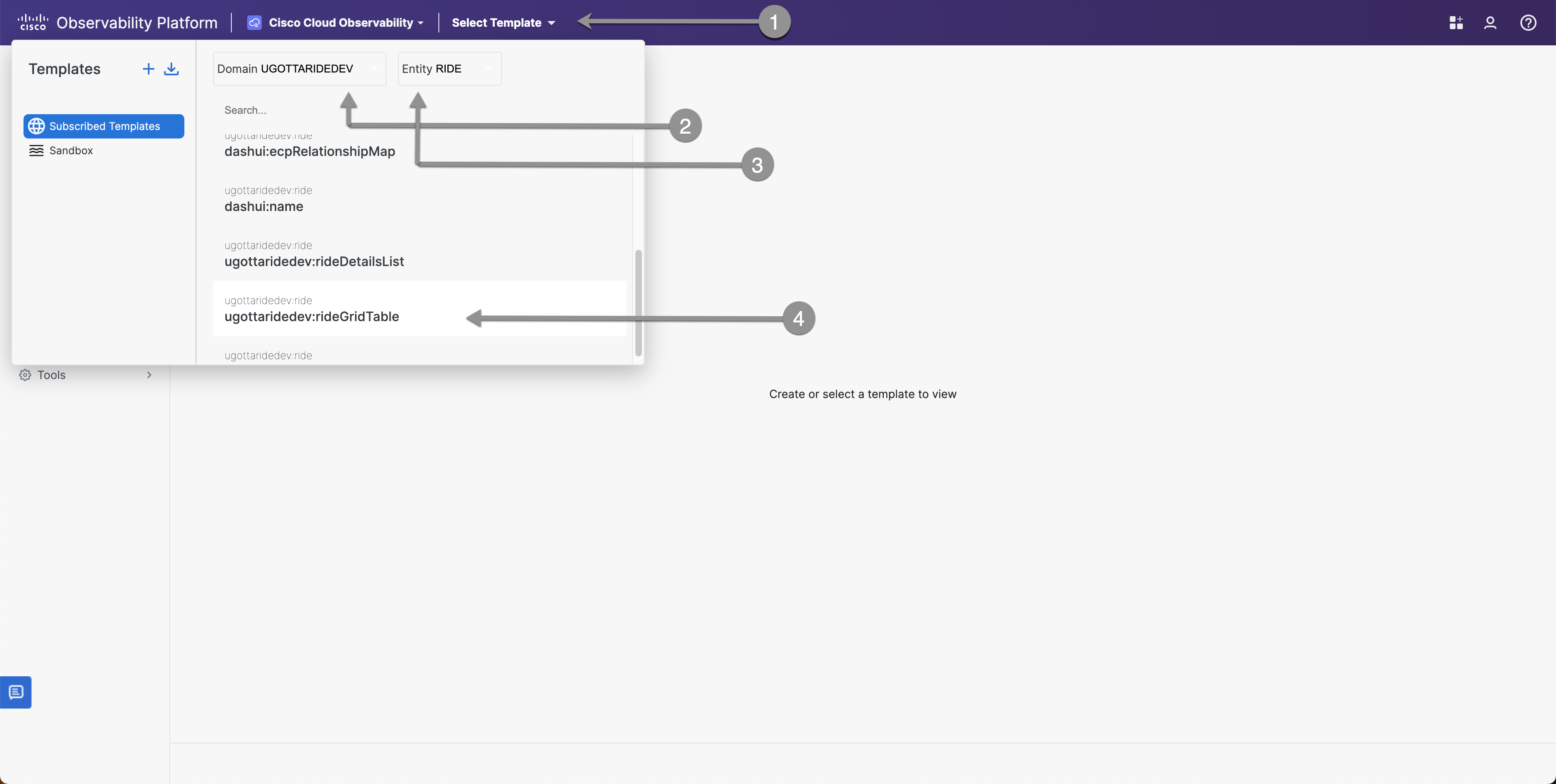
Selecting the UI Entity: Navigate to https://appd-channel.observe.appdynamics.com/ui/authoring
- Click on Select Template.
- Select Domain: UGOTTARIDEDEV
- Select Entity: Ride
- Find and Select ugottaridedev:rideGridTable
Adjusting Grid Column Widths
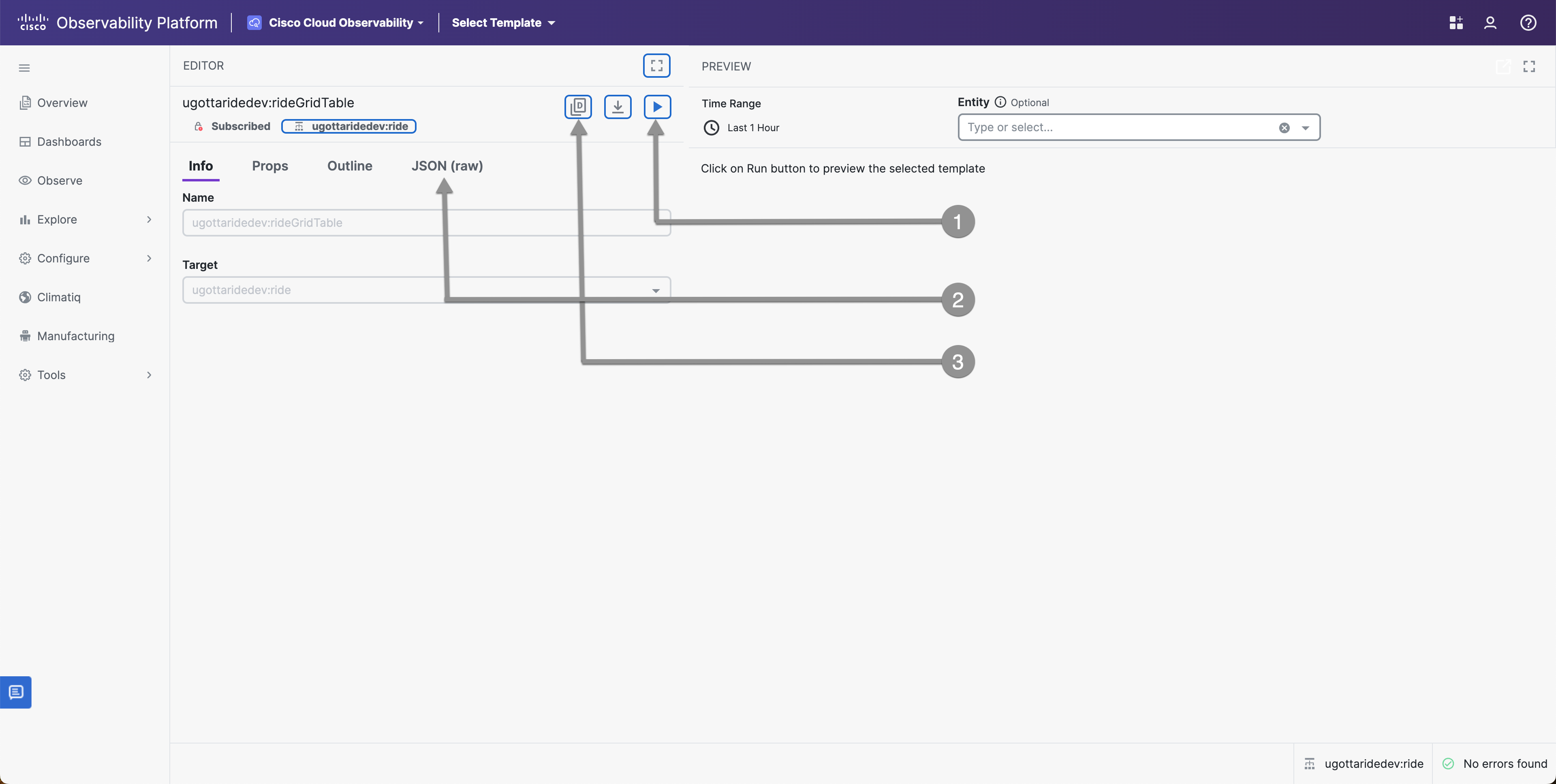
- Click on The Play Button
- Click on JSON(raw)
- Click on Duplicate Template
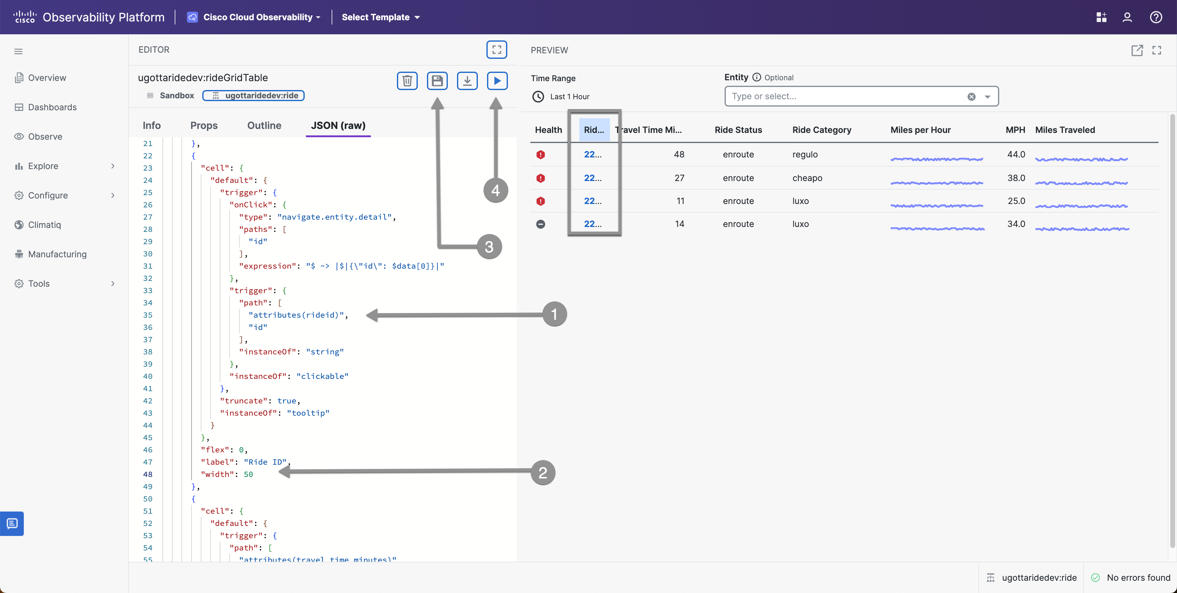
Notice that the Ride ID Column is too small to display the entire header in the image below - Lets make some changes in the Authoring Tool to find the correct width
- Find the Ride ID Column
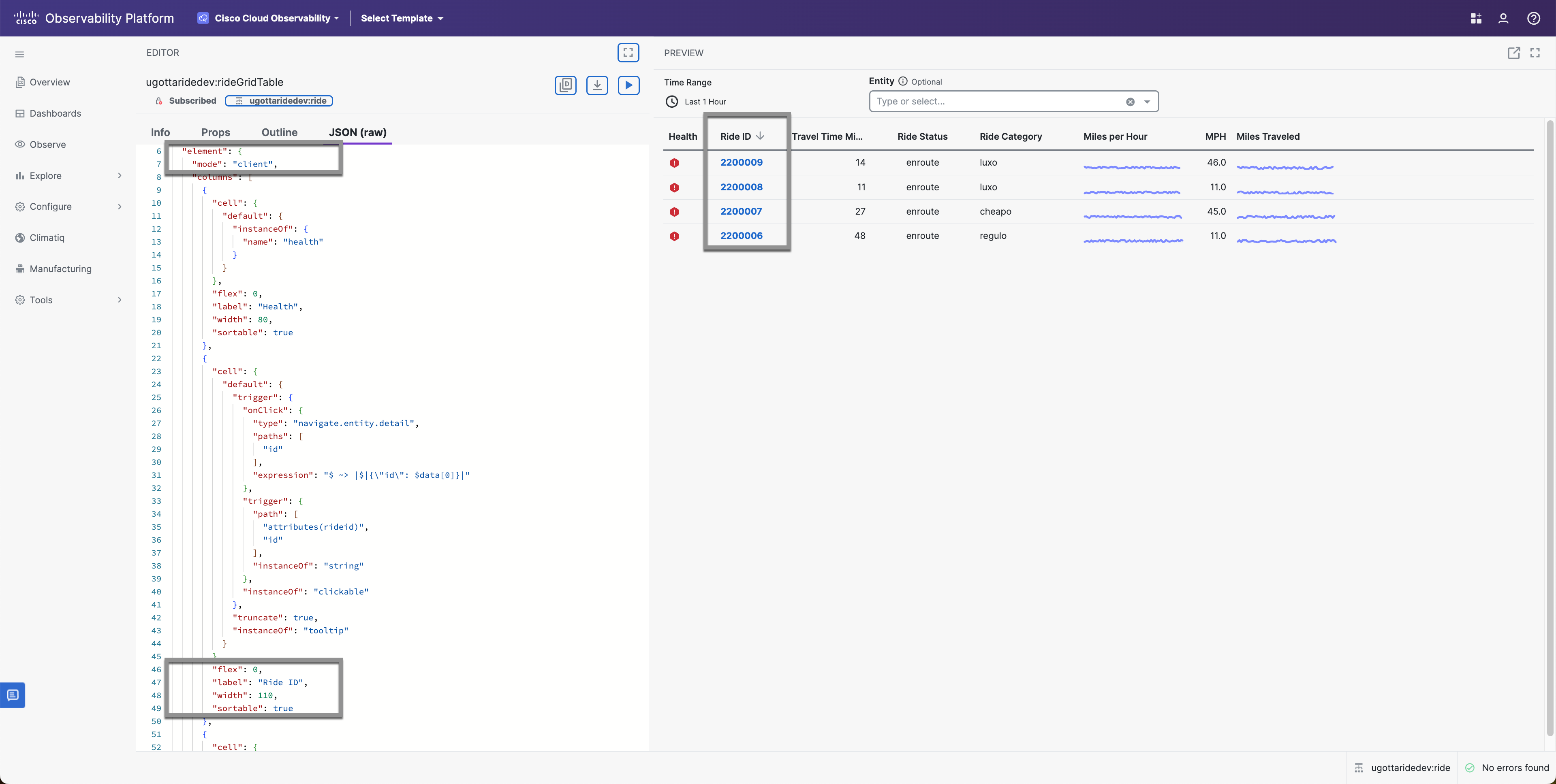
- Adjust the Width to a larger number
- Click on Save
- Click on Play to review your changes
Sortable Grid Columns
Another easy task that adds nice functionality is the making the columns sortable. In order to do this we need to make sure that the Elements mode is set to client and you can easily add the sortable attribute to each column.
You can also set default sorting on columns by adding “sort”: “desc” or “sort”: “asc” after the “sortable”: true field.
            {
                "label": "Ride ID",
                "flex": 0,
                "width": 110,
                "sortable": true,
                "sort": "desc",
                "cell": {
                    "default": {
                        "instanceOf": "tooltip",
                        "truncate": true,
                        "trigger": {
                            "instanceOf": "clickable",
                            "onClick": {
                                "type": "navigate.entity.detail",
                                "paths": [
                                    "id"
                                ],
                                "expression": "$ ~> |$|{\"id\": $data[0]}|"
                            },
                            "trigger": {
                                "instanceOf": "string",
                                "path": [
                                    "attributes(rideid)",
                                    "id"
                                ]
                            }
                        }
                    }
                }
            }